In the Realm of Color Psychology, I'd Steer Clear of Certain Decorating Practices - Avoiding Trends and the 'Red Thread' Technique
In the realm of interior design, the art of choosing colors is no longer a mere aesthetic decision, but a strategic move that aims to influence emotions, behaviors, and overall wellbeing. This approach, known as color psychology, is increasingly being adopted by designers to create spaces that support personal behavior and comfort.
At the heart of this strategy lies the designer's initial inquiry: understanding how the space should support the user and what kind of behavior it should encourage. This inside-out approach ensures that colors are selected according to the emotional and behavioral goals of the space.
Different colors evoke specific psychological and emotional responses. For instance, cool colors like blue, green, and lavender tend to calm the mind, reduce stress, and promote focus and relaxation, making them ideal for bedrooms, bathrooms, or home offices. On the other hand, warm colors such as red, orange, and yellow stimulate energy, enthusiasm, and creativity, making them suitable for social or active spaces like kitchens, dining rooms, or creative studios.
However, it's not just about the color itself. The psychological effect of color depends on its intensity and placement. A bold red accent can energize a space, but overuse may cause anxiety or aggression. Balance is key, such as layering colors through textiles or accessories rather than overwhelming a room with one color.
Function-driven color choices are another crucial aspect. Designers recommend first defining the room’s function, desired mood, and considering lighting effects before choosing colors. This thoughtful approach ensures colors support wellbeing and behavior appropriately.
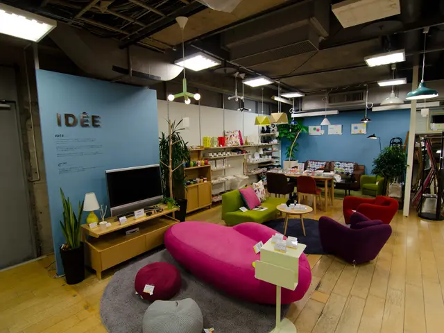
Neutral tones like beige, taupe, and soft browns create a grounded, balanced, and comfortable backdrop that stabilizes the space without overwhelming emotions. They complement more vivid colors and contribute to a calming atmosphere.
Texture, scale, and light also influence how color impacts mood and comfort. These elements combined can create a harmonious and balanced environment that supports mental and emotional wellbeing.
Lastly, color should be used thoughtfully to create desired atmospheres—from relaxing and harmonious to energetic and stimulating—supporting personal behavior and creating livable, unique spaces rather than following trends blindly.
In essence, the principles of color psychology in interior design emphasize selecting colors according to the emotional and behavioral goals of the space, balancing intensity and context, and integrating other design elements to create environments that promote wellbeing, focus, relaxation, creativity, or social interaction as needed. This scientific and intentional approach to color usage transforms interiors into spaces that nurture personal behavior and mental health effectively.
- Understanding the user's needs and the desired behavior of a space is the foundation for a designer's color choices, following the inside-out approach in interior design.
- Cool colors, such as blue, green, and lavender, have a calming effect on the mind, making them suitable for spaces intended for relaxation, like bedrooms, bathrooms, or home offices.
- Warm colors, like red, orange, and yellow, stimulate energy and enthusiasm, making them suitable for spaces meant for social or active activities, such as kitchens, dining rooms, or creative studios.
- The intensity and placement of colors can dictate the psychological effect they have, with a bold red accent energizing a space, but overuse potentially causing anxiety or aggression.
- Function-driven color choices are essential, necessitating defining the room's purpose, the desired mood, and considering lighting effects before selecting colors to ensure they support wellbeing and behavior appropriately.
- Neutral colors create a stable and comfortable backdrop that complements more vivid colors and contributes to a calming atmosphere, while texture, scale, and light also play a crucial role in influencing the mood and comfort a space evokes.

