
Guide to Design Principle: Proximity
In the world of design, proximity is a fundamental principle that plays a crucial role in effectively organizing information and visuals. This principle, when applied thoughtfully, can significantly enhance the user experience by making content easier to perceive and understand.
In a business context, clear communication is paramount, and flashiness or creativity should never overshadow the importance of effective organization. The brain is more likely to perceive nearby elements as related due to the proximity principle, making it an invaluable tool for conveying information and establishing connections.
Practical tips for using proximity in design include placing related elements close to each other to form clear visual groups. For instance, in user interface (UI) design, grouping related UI elements like labels and input fields close together can make them easier for users to associate naturally and reduce cognitive effort. Strategic use of whitespace can also separate different groups clearly, ensuring unrelated elements have enough space between them to avoid confusion.
Proximity can also help guide user attention by creating visual clusters, making interfaces more intuitive and easier to navigate. By arranging interactive elements that function together near each other, user errors can be minimized, and usability improved, as supported by Fitt's Law.
However, it's important to avoid placing unrelated elements too close to each other, as this can create incorrect associations. Proximity in combination with other visual principles, like figure-ground and common fate, can enhance clarity and focus, helping users perceive focal points or moving groups effectively.
Simplifying a design can also help maintain the proximity principle. In document design, items placed nearby each other are considered related, while those that are far from each other are unrelated. For example, in a flyer, text can be placed in close proximity to icons that describe them, creating an unmistakable connection.
In design, thinking like a reader and being thoughtful about element placement is crucial. Proximity applies to all elements in a composition, including headings, body text, graphics, images, illustrations, icons, shapes, and more. Proximity is an important bridge to other design principles, including hierarchy and balance.
It's essential to know what you want to say before applying the proximity principle. Proximity isn't a state; it's a range. Close enough to create a connection or far enough away to break a connection are examples of proximity in design. White space, or negative space, can be used to establish or not establish connections between elements in a design.
If you can master proximity, along with a few other basic design principles, your work will not only be beautiful but informative for your audience. A template can be used as a graphic design tip to help with the placement of elements in a design. The bar graph at the top of a page is an example of the proximity principle in use, with labels placed immediately to the right of the bars to help the reader understand the data.
In conclusion, the proximity principle, when used effectively, can significantly streamline information processing and promote a better user experience. By placing related elements close to each other and using whitespace strategically, designers can create visually pleasing compositions that are intuitive, easy to navigate, and communicative.
In a lifestyle context, carefully organizing elements in a fashion-and-beauty article can make it more visually appealing and easier for readers to comprehend. For instance, grouping related images and product descriptions together can create a cohesive, clear presentation that enhances understanding.
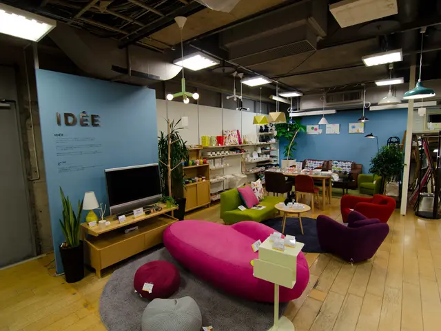
A well-designed home, garden, and furniture catalog can benefit from the proximity principle, as placing similar items or images in close proximity can help users find what they need more efficiently and understand the relationship between different products. Strategically placed whitespace can also separate different sections clearly, creating a well-organized, easy-to-navigate layout.

